Work
Following DeakinPrime’s recent brand refresh, synrg was given the opportunity to design and develop a fully responsive website for DeakinPrime, the Corporate Education arm of Deakin University.
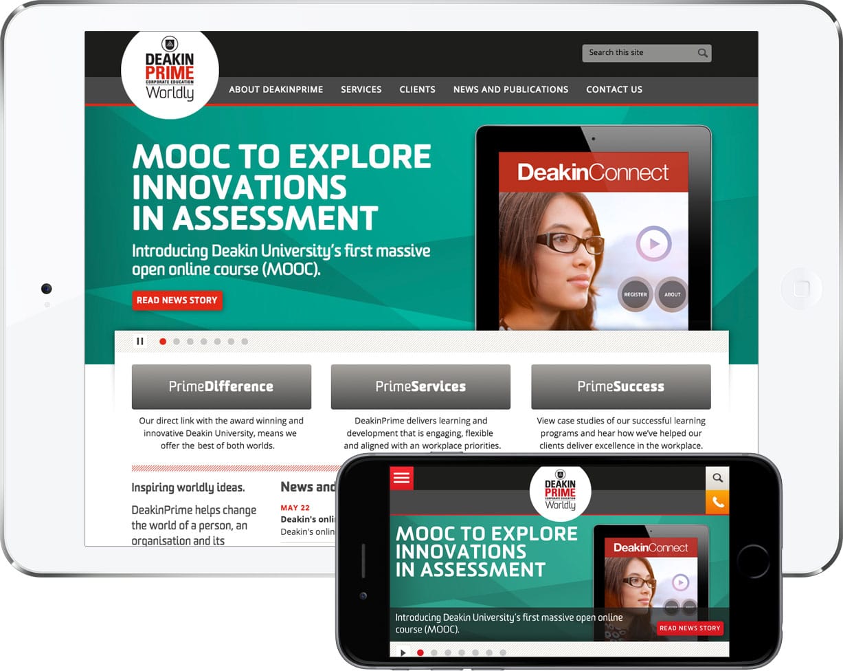
The website needed to stay aligned to the Deakin University parent brand while maintaining its own independent visual style.
Extensive website, competitor and industry analysis was conducted to determine the most popular sections and pages, and the web architecture (and hierarchy) was restructured to suit the results.
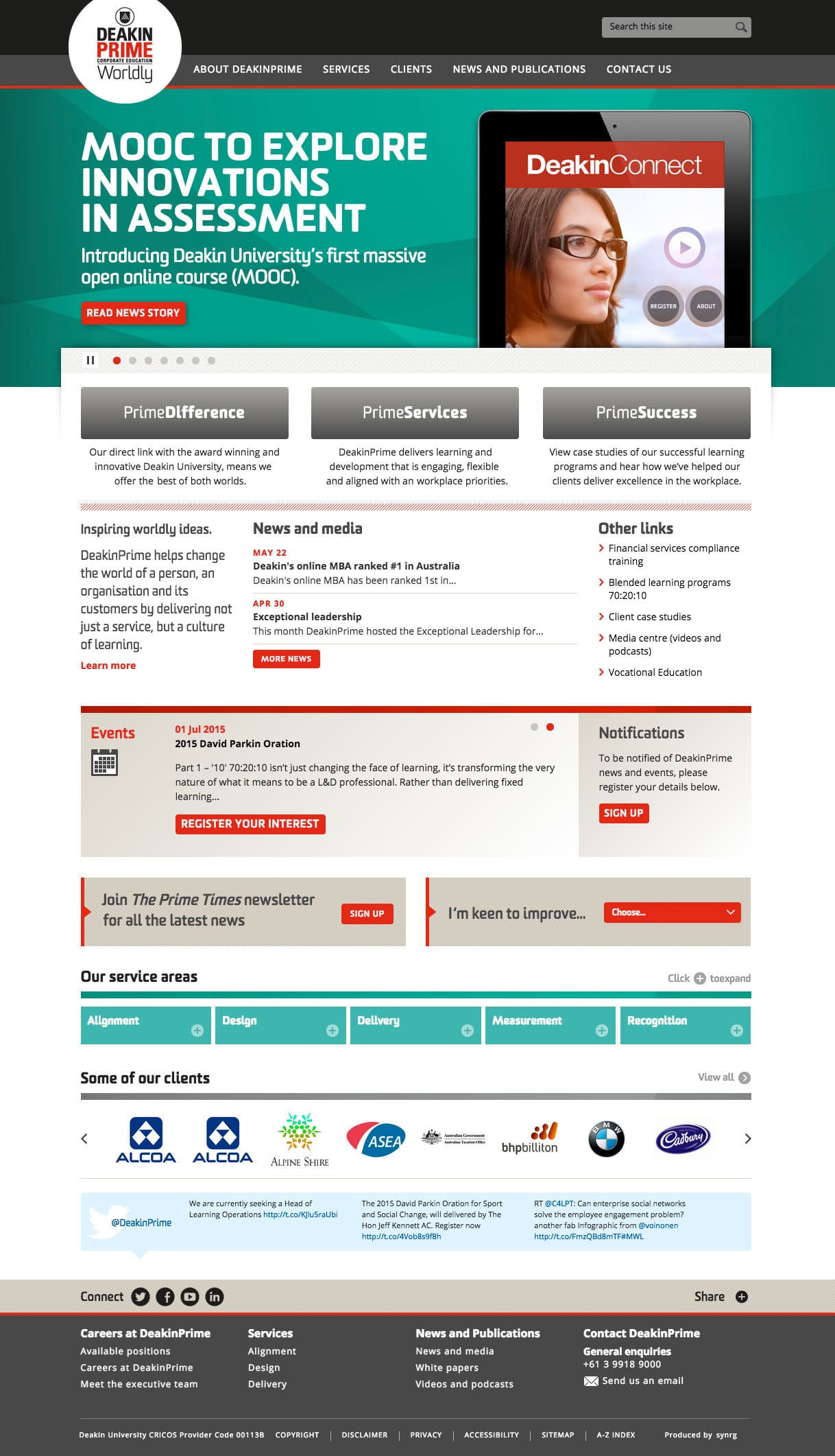
The design reflected the need for more content rich pages, social media integration and for greater search engine optimisation. Page layouts were structured to align with content hierarchy and device dependency. Essentially, the layouts change shape to adapt to and fit various screen resolutions, therefore the site works and displays equally well across an iPhone as it does across a large desktop computer.
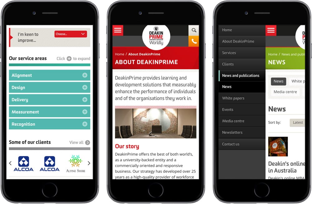
In an effort to achieve a better mobile device friendly design and improve user experience, the navigation was limited to three levels. jQuery mobile and jQuery tabs were also used to hide and show content heavy pages, so smaller screens only display important and critical information.
5 July 2013
Rob and his team were fantastic to deal with and we love the new website. The designs they provided were fresh and current and the feedback we receive regularly is extremely positive.
Georgie Fidge
Marketing Manager, DeakinPrime