News
Is your website optimised effectively for all devices? We don’t just mean mobile or desktop – think every single device and user on the web.
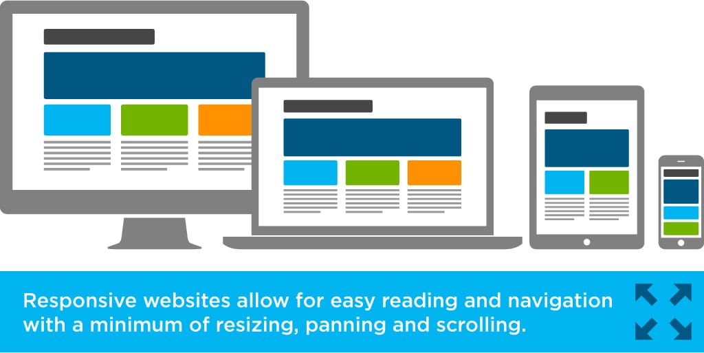
Responsive websites are designed to provide an optimal viewing experience across all platforms.

Responsive web design refers to a website designed to adapt to whatever device a visitor is using.
Responsive sites have the ability to respond to any movements you make.

Responsive design allows the same website to adapt to the screen they are on without compromising functionality or aesthetics.

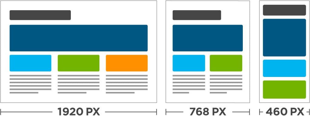
Responsive design targets the width of each user’s web browser to determine how much space is available and how it should display the website. Breakpoints are set up to allow us to target ranges that define specific displays. For example, you generally see breakpoints for phones, tablets and desktops.
Unlike isolated mobile websites, responsive design adapts the layout to the viewing environment by using fluid, proportion-based grids and flexible images.


Do we need to say more?

Be responsive, call us now on info@syn-rg.com.au
26 May 2015