Websites should be easy to navigate, allowing visitors to search for the content they need... and find their way home.
Nearly every website you visit will have the following pages:
Ten years ago, those 4 pages were probably the only pages contained in a website. Now we see public facing websites with hundreds of pages, each with varying degrees of relevance and importance to the overall website, and the business it is promoting.
With search engine ranking results improved by the amount of relevant content to your business displayed on your website, menu structures can become confusing as visitors get lost within deeply embedded content.
A well thought out site map will assist in creating a logical and intuitive menu structure.
Creating a site map is probably the first and most important step when designing and building a new website. It will involve time, people (key stakeholders) and research. It can be a lengthy process deciphering the hierarchy for your website pages, and refinement is essential to maintaining a site map free of loose ends.
Your key stakeholders can be members of your marketing team, digital team, IT department and sales. They will each have there own opinion on which are the most important sections and pages, and this collaboration will create a more balanced site map.
Lastly, research is necessary to define your website objectives. Understanding who your visitors are and what information they need will be important in determining which page or section content is placed.

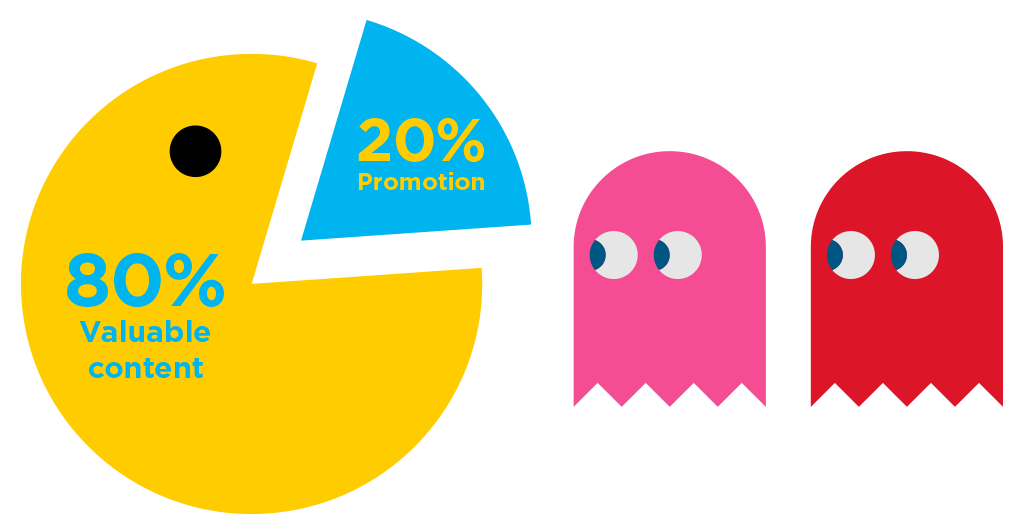
To help refine your content, work to the principal of the 80/20 rule (80% valuable content / 20% promotion). This will give your team some focus. It will strip out any extraneous content, and filter your content down to what is most important.
Consider what information you’d like to share about the company. Are you giving away too much? If your current or previous clients/customers are happy with your work, show their testimonials.
Once you’ve figured out what content you’d like to present on your website, the next step is creating a menu structure.

Now that you’ve got all of your content refined, defining your navigation should be easy. Your Level 1 or primary navigation will house the main sections of your website. Visitors need to be able to peruse sections and their second or third level pages easily. It should allow for growth within sections, be concise and easy to understand. It is best to avoid using internal language or terms when naming your ‘Level 1’ sections. This will allow visitors to find the relevant information to their needs more easily.
Once a solid Level 1 structure is created, defining your 2nd and 3rd level structure should be simple. Unlike Level 1, where names should be concise, names within these sections can be whatever you like, as long as it is relevant to the page content.
Typically, a website with 50 pages or less can be kept to a Level 1 and 2 structure. Beyond that, a 3rd level may be required. As you go along with the process, you may need to make tweaks and edits to your Level 1 structure.
Pages such as legal disclaimers, privacy policies, and any utility pages, need to be considered in your site map structure too. They can be placed in the footer, along with a repeat of the Level 1 items.
By now you should be ready to attach a template to each page. This process can be confusing as some content can fall under a multitude of possible templates. Is it an image gallery? A simple one-column page? Does the page require downloads? Although this process can be confusing and time consuming, it is important as this will help reduce the overall design time.
Picture the entrance of a supermarket. It’s no mistake they often start with the bakery, fruit/vegetables and meat, and flow through all of the other aisles until you get to the milk and dairy. These are the essential items. They bookend all of the other products on offer. You can avoid all of the unnecessary items if you choose not to go down an aisle. But the important products cannot be avoided before the checkout.
A menu structure should work in the exact same way. Important information up front introducing the business and it’s services, bookended by the necessary contact details. How you structure your menus, will define whether visitors detour down an aisle they didn’t expect to go, allowing them to discover more information about your business.
Helping your visitors find their way around your website is no mistake, it has been carefully considered. Your visitors should be able to find the information they need, but also the information you want them to find. Call to action links and related page links allow visitors to click through and find other useful information they might need. Without allowing your visitors to become completely lost, a little venture ‘off course’ can lead to some wonderful discoveries.

3 February 2016